|
||||||||||||||||

|
||||||||||||||||
School NewsletterSeptember 2026Inspirations, Insights, and Staffing Solutions 
|
||||||||||||||||
Upcoming EventsConferences & Industry Opportunities |
||||||||||||||||
| ||||||||||||||||
|
||||||||||||||||
Educator FocusFor Preschool Classroom Design, Less is MoreBy Cecilia Cabrera Martirena 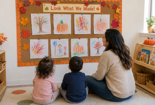
Throughout my many years as a preschool teacher and pedagogical adviser supporting teachers in their practice, I have come to appreciate that less is more. So, what does this mean? Should we avoid color and visual displays altogether? No, thoughtfully designed classrooms do not need to be empty. By carefully selecting what is displayed and giving visual elements space to breathe, we can create environments that are welcoming but also calmer and more respectful of children’s developmental needs. Designing for children and with children Making displays work for children Designing spaces that help children focus Using Color Strategically Children need environments that offer stimulation and create opportunities for deep engagement, supporting their curiosity without overwhelming it. In my experience, the most effective environments are the ones that embrace simplicity and common sense. *Excerpts taken from “For Preschool Classroom Design, Less is More” By Cecilia Cabrera Martirena |
||||||||||||||||
Activity of the Month!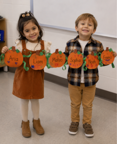
Pumpkin Vine Name CraftMaterials Needed:
Have each child decorate a pumpkin and write their name in the center. Once everyone is finished, connect the pumpkins with green paper vines and display them together on a wall or bulletin board to create a festive pumpkin patch. |
||||||||||||||||

ChildCare Careers is your trusted partner in staffing. Need coverage or planning ahead? |
||||||||||||||||
| © ChildCare Careers | Unsubscribe | www.ChildCareCareers.com |